Appearance
Customization
You can change how Aurora looks: the theme, the accent colour, backgrounds, covers, fonts and the sidebar. Most of these settings live under Settings → Preferences. Workspace-wide defaults that owners set for everyone live under Settings → Workspace → General.
Theme
Aurora has 32 named themes plus System, which follows your operating system's light or dark setting. The default is Dark.
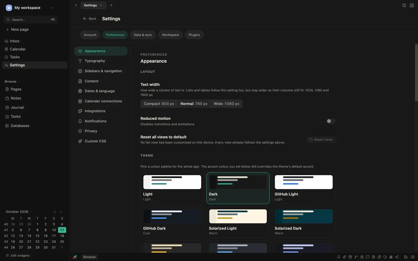
To pick a theme:
- Go to Settings → Preferences → Appearance → Theme and choose a card. Each card shows a small preview.
- Or click the theme button in the status bar at the bottom of the window. The Mode row switches between Light, System and Dark, and the swatches below it switch to any named theme. Open theme settings takes you to the full list.
Your theme is saved on the device you are using.
Light themes: Light, GitHub Light, Solarized Light, Sepia, Parchment, Linen, Honey, Bone, Mist.
Dark themes: Dark, GitHub Dark, Solarized Dark, Gruvbox Dark, One Dark, Tokyo Night, Dracula, Nord, High contrast (dark), Ember, Blossom, Twilight, Sunset, Slate, Inkwell, Sapphire, Obsidian, Espresso, Forest, Onyx, Charcoal, Carbon, Mocha.
Charcoal, Carbon, Mocha, Bone and Mist are flat themes: the sidebar uses the same background as the page.
Accent colour
Go to Settings → Preferences → Appearance → Accent color. There are nine accents:
- Aurora (teal, the default)
- Blue
- Copper
- Purple
- Pink
- Red
- Orange
- Green
- Gray
Each swatch is a fixed pair: the left half is used in light themes and the right half in dark themes. The accent is chosen per workspace and saved on the device you are using, so two workspaces can have different accents.
The accent you choose overrides the theme's own accent. With Aurora selected, named themes use their built-in accent.
Layout, fonts and the app icon
Under Settings → Preferences → Appearance you can also set:
- Text width: Compact, Normal or Wide.
- Reduced motion: turns off transitions and animations.
- App logo style: Classic Color (the default), Aurora Color, Classic Monochrome or Aurora Monochrome.
- Cover and media: Cover width (Fill the window or Match text width), Cover image height (Compact, Normal, Tall or Full screen), and whether to fade the bottom of the cover image.
Font size, line height, paragraph spacing and fonts are under Settings → Preferences → Typography.
Page covers
At the top of a page, choose Set cover image. The picker has three tabs:
- Gallery with Defaults (the Aurora artwork, such as Aurora Horizon, Aurora Fjord and Aurora Nebula), Gradients and Photos, plus your uploaded and AI-generated images and the workspace library.
- URL / Upload for your own image.
- ✨ AI to generate a cover, when AI image generation is available to you.
Cover gradients include Purple, Blue, Green, Pink, Sunset, Deep sea, Lavender, Peach, Sky, Spring, Morning, Night, Silver, Steel, Aurora, Cosmos, Gold, Emerald, Fire, Violet, Forest, Crimson, Slate, Candy, Mint, Copper night, Ember mist, Bronze aurora and Cinder glow.
Once a page has a cover, you can reposition it, change opacity and blur, turn the fade on or off, or remove it.
Backgrounds
You can put an image or gradient behind a page or behind app screens such as Home, Inbox, Calendar and Tasks.
- On a page, choose Background image at the top of the page.
- On an app screen, use the background button in the screen's header.
Background gradients include Midnight, Deep ocean, Nebula, Cosmic, Forest night, Crimson void, Abyss, Teal depths, Dark matter, Ember, Emerald, Indigo, Polar tide, Aurora veil, Fjord glow, Magnetic dusk, Copper twilight, Northern pine, Arctic bloom and Solstice ember. There are also photos and the Aurora artwork.
The background popover lets you set opacity and blur, whether the background is fixed or scrolls with the page, and Stop at right panel or Extend behind right panel. On app screens, workspace owners also see Save to: For me (only you see it) or Workspace (it becomes the workspace default for that screen). Other members' backgrounds are always personal.
Workspace defaults
Workspace owners can set defaults for everyone in Settings → Workspace → General → Workspace backgrounds:
- Workspace default sidebar background.
- Workspace default (all pages), which applies everywhere unless something more specific is set.
- One row per screen, such as Home, Inbox, Calendar, Tasks, Graph, Habits, Template gallery and Settings.
The most specific background wins: a page's own background, then your personal background for that screen, then the workspace background for that screen, then the workspace default. Members can always set their own background on top of the workspace default.
Right-panel overlay
If a busy background makes the right panel hard to read, adjust Right-panel overlay in Settings → Preferences → Sidebars & navigation. Lower the opacity to let the background show through, and add blur to soften it.
Sidebar and navigation
Go to Settings → Preferences → Sidebars & navigation.
Sidebar
- Rainbow mode colours sidebar items in a rainbow spectrum. Choose Text color or Background color.
- Show sidebar icons and Sidebar icons (Monochrome or Colorful).
- Your sidebar background sets a personal sidebar background. Clear it to use the workspace default.
- Show nested pages under pinned items.
- Space navigation mode: Mixed navigation treats spaces like normal pages; Spaces-first makes a space a browsing scope in the sidebar.
Right sidebar
Choose which widgets appear in the right panel: Calendar, Graph, Today's tasks, Tags, Pomodoro, Backlinks, Journal, Pinned properties, Related notes and Knowledge hygiene.
Navigation and layout
- Navigation links: place each link (Home, Inbox, For you, Calendar, Week Planning, Tasks and more) in the Sidebar, the Icon bar in the status bar, or Hidden.
- Sidebar sections: show or hide Favorites, Recently visited, Journal, Templates and Areas / Spaces.
Default open mode
Choose how pages open when you click a link: Full page, Popup or Split, set separately for Inbox and for each page type.
Some of these preferences are saved only on the device you are using.
Custom CSS
Go to Settings → Preferences → Custom CSS, type your CSS and click Save. It applies straight away, on this device only. Click Clear to remove it.
css
/* Example: wider content column */
.ProseMirror {
  max-width: 800px !important;
}
If something looks wrong after you add custom CSS, clear it first.
Dates and language
Set the language, week numbers, first day of the week, date format and timezone in Settings → Preferences → Dates & language. The timezone decides what "today" means in the calendar, on Home, in the Journal and for reminders.
Keyboard shortcuts
Shortcuts are fixed and cannot be changed. See Keyboard shortcuts for the full list, or press ⌘/ (Ctrl+/ on Windows and Linux) in the app.